Search Icon

Classroom Color Planner

Use our interactive tool below to explore how color can support different learning environments

Color plays a powerful role in how students feel, behave, and engage in the classroom. The right color choices can help support focus, encourage collaboration, reduce overstimulation, and create spaces that feel both welcoming and intentional.

To make color planning more approachable, we’ve created an interactive classroom color planner based on widely accepted principles of learning environment design. Use the tool below to explore color recommendations by classroom goal and energy level, and see how thoughtful color use can support a wide range of teaching styles and learning needs.

Classroom Color Planner

Choose a classroom goal and energy level to see a practical color approach—what to use on walls, where to add accents, and how to keep the room calm, focused, and flexible.

Interactive planning tool

1) Select your primary classroom goal

2) Adjust the room energy

CalmBalancedEnergizing
Tip: Use stronger colors mostly as accents. Keep large surfaces calm and consistent for better focus.

Recommended Color Direction

Best fit for

Focus & Testing — Balanced

Calm, cool tones reduce visual stress and help students sustain attention—ideal for instruction-heavy and assessment settings.

Suggested palette: soft blues/greens + warm neutrals for balance.

Where to use these colors

Walls: light neutral + soft blue/green accents. Furniture: durable neutrals with a few color pops for wayfinding.

Do / Don’t

Do: keep large surfaces light and calm. Don’t: use high-saturation red/orange across big wall areas.

This tool provides practical guidance for learning environments. Always consider lighting, room size, and district standards.

Classroom Color FAQs

Practical answers to common questions about using color to support focus, behavior, and flexible learning environments.

What are the best classroom colors for focus?

In most learning environments, softer cool tones (like blues and greens) paired with light neutrals help reduce visual stress and support sustained attention. Use higher-saturation colors sparingly as accents rather than dominant wall colors.

Should classroom color be different by grade level?

Often, yes. Younger learners tend to respond well to warm, welcoming palettes with clear zones and wayfinding, while older students benefit from calmer, more mature schemes with controlled accents that support focus and independence.

How much color is “too much” in a classroom?

If students feel overstimulated—or the room feels visually “busy”—reduce saturation and limit the number of competing hues. A helpful rule is to keep large surfaces neutral and concentrate bold colors in specific, intentional areas (like signage or storage).

Where should I use color: walls, furniture, or accents?

For most classrooms, start with a calm wall base (light neutrals), then add color through furniture, soft goods, and accessories. Accents are great for defining zones, supporting collaboration, and creating visual structure without overwhelming the space.

How does lighting affect classroom color choices?

Natural and artificial lighting can shift how colors look throughout the day. In low-light rooms, avoid very dark or overly cool palettes that can feel dull. Test paint or finish samples under the room’s actual lighting before finalizing a scheme.

What colors work best for sensory-friendly classrooms?

Sensory-friendly spaces typically perform best with low-contrast, muted palettes and consistent finishes. Avoid intense primary colors as dominant elements, and use gentle accents (muted greens/blues) to support calm and regulation.

Impoact Of Color Schools

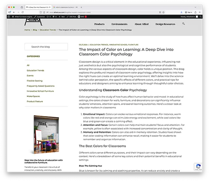
Read more about choosing the right colors on our blog

Our in-depth color article walks through recommended impact of color by grade level. It also explains why proper color selection matters.

X

Sign In With Google

Use your Google account to keep track of your favorites products and share them with others.

Cancel